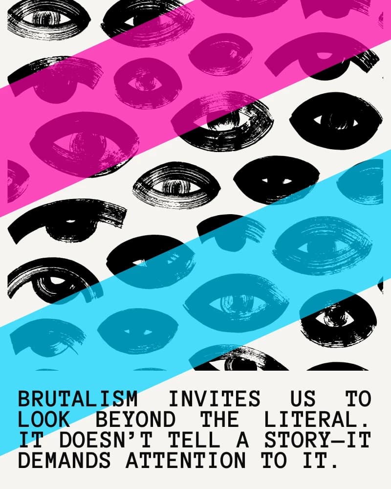
Leave the edges raw and the hierarchy clear.
There's a growing movement in digital design that embraces rawness over polish. The New Brutalism isn't about being ugly—it's about being honest. It's a rejection of the homogenized, rounded-corner, gradient-heavy aesthetic that dominates modern interfaces.
Where It Came From
The term "Brutalism" originates from the French "béton brut" (raw concrete), describing the architectural movement of the 1950s-70s that celebrated exposed materials and structural honesty. Think of Boston City Hall, the Barbican Centre in London, or Habitat 67 in Montreal—buildings that don't hide what they're made of.
Web Brutalism emerged around 2014-2016 as designers began questioning whether every website needed to look like a startup landing page. Sites like Craigslist (accidentally brutalist since 1995), Bloomberg's 2015 redesign, and the Yale School of Art's intentionally chaotic website became touchstones.
The Psychology of Raw Design
Why does brutalist design resonate? A few reasons:
Authenticity in an age of polish. When everything looks the same—the same Figma components, the same Unsplash photos, the same Inter font—rawness becomes distinctive. It signals: "We're confident enough not to hide behind trends."
Cognitive load reduction. Paradoxically, brutalist sites can be easier to use. When there's nowhere to hide, the hierarchy must be clear. You can't fake usability with drop shadows.
Memorable friction. A little bit of friction makes experiences stick. Bloomberg's dense, information-heavy interface isn't "easy"—but it's unforgettable.
Typography as Architecture
In brutalist web design, typography does the heavy lifting. Here's a pattern I've been using:
.brutalist-heading {
  font-family: 'Space Grotesk', 'Arial Black', sans-serif;
  font-weight: 900;
  font-size: clamp(3rem, 15vw, 12rem);
  line-height: 0.85;
  letter-spacing: -0.05em;
  text-transform: uppercase;
}

.stacked-text {
  position: relative;
}

.stacked-text::before,
.stacked-text::after {
  content: attr(data-text);
  position: absolute;
  top: 0;
  left: 0;
  z-index: -1;
}

.stacked-text::before {
  color: #22d3ee; /* cyan */
  transform: translate(2px, -2px);
  opacity: 0.6;
}

.stacked-text::after {
  color: #db2777; /* pink */
  transform: translate(-2px, 2px);
  opacity: 0.6;
}
The stacked text effect—multiple offset copies of the same text—creates depth without gradients or shadows. It's a purely typographic solution.
Examples Worth Studying
Bloomberg (bloomberg.com) - Dense, unapologetic, information-first. The 2015 redesign by Code and Theory proved that brutalism could work at scale.
Balenciaga - High fashion meets anti-design. Their website periodically goes fully brutalist, challenging luxury conventions.
The Outline (RIP) - Before it shut down, The Outline showed how brutalism could be playful and readable.
Hacker News - Not intentionally brutalist, but its refusal to "modernize" has become a statement.
gov.uk - Proof that brutalist thinking (clarity over decoration) serves users better than aesthetic flourishes.
Resources
- "Brutalist Websites" (brutalistwebsites.com) - A curated collection since 2014
- "Web Design in 4 Minutes" by Jeremy Thomas - Demonstrates how little styling you actually need
- "Refactoring UI" by Adam Wathan & Steve Schoger - The opposite philosophy, useful for understanding what brutalism rejects
The Uncomfortable Truth
Brutalism isn't for everyone, and it isn't for every project. A healthcare app probably shouldn't look like a concrete bunker. But for portfolios, editorial sites, and brands seeking distinction, it offers an alternative to the Figma-template monoculture.
The question isn't whether brutalism is "good design." It's whether you're designing intentionally or just following patterns. Sometimes the most refined choice is to leave the edges raw.